
✦
Meyd.it
✦
A slow fashion platform connecting ateliers and customers.
Overview
Timeframe
15 Weeks 4 Sprints
Responsibilites
UI/UX Design
Prototyping
User Research
Disiplines
UI Design
User Research
Tools
Figma
Jira
Slack
Meyd.it is a FashTech startup based in Sydney, dedicated to promoting slow fashion. The platform connects clients with local ateliers and garment makers to create custom-made clothing. At the same time, it offers creatives a space to find clients, showcase their work, and grow their businesses. Its mission is to support a more sustainable fashion industry, where quality craftsmanship, ethical practices, and safe working conditions are prioritised. By focusing on slow fashion, each garment is made with care, using sustainable materials, and fostering a fair and transparent production process.
I Interned as a UI/UX Designer with the goal of gathering user feedback from the perspectives of the "client" through user testing, redesigning the platforms landing page, and making adjustments to the current design of the platform.
Goals
01
Gather user feedback to gain insight on how a "client" may interact with the Meyd.it platform to have a garment custom made for them.
02
Communicate the platforms value proposition to users effectively to generate leads and convert visitors through the platforms landing page.
03
Improve the process of creating a custom order for a garment as a "client".
04
Iterate upon the existing user-interface with a focus on user-centric functionality and modern design aesthetics.
Conducting User Field Studies
Testing Methdology
We conducted a usability test with 3 different users in order to identify possible usability issues when signing up and ordering a garment on the platform in a rapid and iterative manner.
How we conducted the study.
We gave each user 4 tasks to complete within the platform, and had them speak out loud their thought process as they complete each task. As they completed each task we noted down their pain points, struggles and issues with the process as well as any feedback they had.
Task
Expected Outcome
Issues Identified
Proposed Changes
The Task the user performs.
What is the user supposed to do?
What happened that caused the issue?
How the issue can be solved?
Tasks Under taken by each user.
Make a Client Account
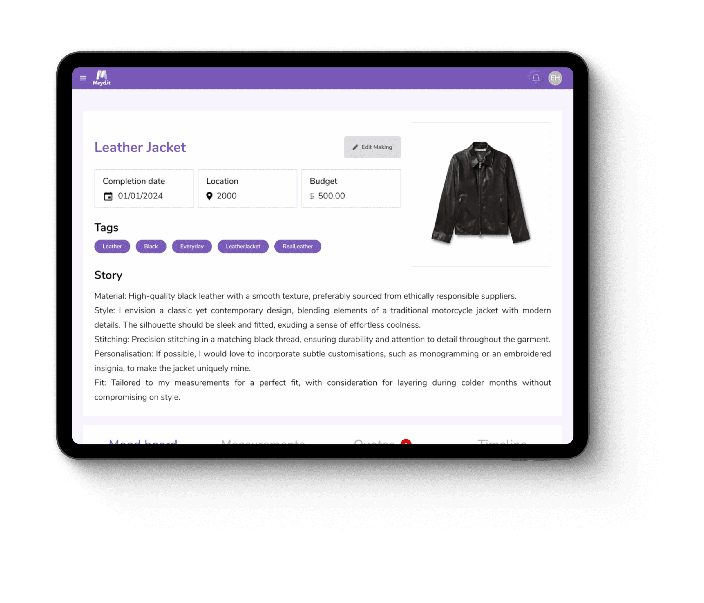
Create a "Making" as a Client
Accept a Quote from a Creative
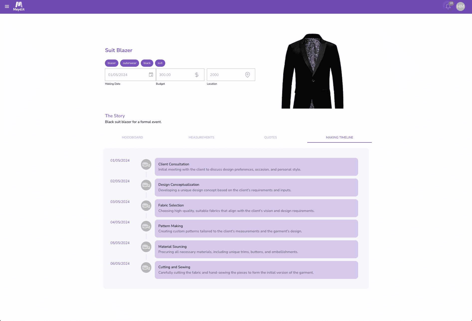
View the "Making" Timeline
Usability Issues
Making a Client Account.
Text within the form was hard to read.
Still could make account even when email was invalid/wrong
Error messaging needs to be more clear, not at the very bottom (e.g. red outline when input field is wrong)

Creating a "Making" as a Client.
Unsure about the function of the Moodboard
Not very clear on how the user can interact with a mood board and what its purpose is.
User was unsure what to click after they have received a notification that the quote was accepted.
User assumed to message the client to accept the quote; was unclear about it for 5 minutes+
The user found that the inspiration images were not very meaningful to the user. Since the user was a male and the images shown were females and dresses.
Wasn’t clear to the user where to navigate upon entering the dashboard.
Requiring the user to write a broad story may not be helpful in describing exactly what the user wants in their garment. Assumes that everyone knows exactly what to write down.


Accepting a Quote from a Creative.
No options to expand or see more information when it comes to accepting or declining the quote.
“Accept and Decline” quote option has a bright red and green buttons. Creating a sense of urgency.
There may be a problem if the dates for each milestone posted by the maker may clash with the client.
Measurements were not required to create a making and for a client to create a making and for a creative to create a quote.

Viewing the "Making" Timeline.
As someone who doesn't have much knowledge in garment making Having the entire timeline shown to the user at once gave the user lots of information that was unknown to them and what the information meant to them.
Usability issue findings and Analysis
Body
Updated Designs
Body
Landing Page
Body